Three Website Design Tips in 2022
It’s a new year, and with the web industry continually changing, you need your website design to stand out in 2022.
Get ahead of your competition by giving your website visitors exactly what they are looking for when they land on your website.
Read on for three basic website tips to transform your site and keep up with the design trends this coming year.
You don’t know what you don’t know…
I’d love to chat about your website goals, marketing goals, and why you should consider making some updates to your own website. When is the last time your site was updated?
- Security is important, how is yours?
- Do you have all the tools you need to help people hire/buy/contact you?
- Backups are important, how are yours?
- Do you have an email list opt in and how effective is it?
- When is the last time you added new content to your site?
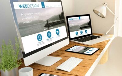
Mobile-First Website Design
In 2021, 55% of website views came from mobile phones. While still very prominent, mobile web traffic slightly edges out desktop web traffic.
What does this mean for your website? On a basic level, your website needs to be mobile-friendly, first.
Through responsive web design, you can identify a theme that proves to be mobile-friendly for your mobile device users. WordPress users will find that a majority of WordPress themes are fully responsive giving them the ability to have websites that look great on mobile and desktop devices.
Mobile-first web design is becoming even more important as Google continues to move toward its mobile-first indexing. This is because the large majority of Google users now use their search engine on mobile rather than desktop.

More White Space
White space on your website doesn’t have to be “white” space. Having white space on your website simply means having blank space around your design elements.
Websites that have filled or cluttered web pages can lead to overwhelm and ultimately for the user to navigate away from the page. Too many images or videos on a page can also slow down the overall web speed.
Adding negative space around images, blocks of text and videos will create a cleaner visual on your web page.
Clean & Modern
As you design or redesign your site this year, be sure to take a modern but clean style approach.
Using bold colors, eye-catching fonts and simple backgrounds will draw in your audience without overwhelming them with too much design.
You want the personality of your business to show through while keeping the interest of your visitors. Think about these design tweaks to keep with a modern style:
- Choose colors to set the appropriate tone
- Include a clutter-free design
- Add small details to make a big impact
- Consider parallax scrolling to create layering and depth
The design of your site should complement your content, not distract from it. Make sure to build upon your design with your customer and clear messaging in mind.
WordPress is an easy website management tool to help you capture the personality of your business while keeping what your customers want in mind.
No Stress Web Development
Drive your business forward this year with a beautiful website design that is clean, responsive, and eye-catching.
If it feels intimidating to think about updating your website to make it more user-friendly, I’m here to help! Save valuable time and utilize a professional designer to bring your ideas to life.
Schedule an appointment to talk about your desires for your website and we can develop a plan together to make it happen.
“I am the founder and primary designer of PCS Creative Services, LLC. With 25+ years of experience in small business operations and communications, and 13+ years of experience in web design, I’ve seen and solved many of the problems faced by business owners. My passion is helping small business owners in Utah build effective, purpose-driven online content. Contact me today.”
Latest from the Blog:
Behind the Curtain: Why Responsive Design is Necessary
Why WordPress themes need to be fluid and adjust to a wide range of screen sizes.Ready to get answers...I'd love to chat about your website goals and why you should use best practices when designing a site to be responsive.I recently had a client who was wondering why...
Behind the Curtain of Pricing a Website Project
Why pricing a website SHOULD include answering 40 questions (or more!).Ready to get answers...I'd love to chat about your website goals, marketing goals, and why you should take my 40 questions challenge.Another day, another "how much do you charge for a website?"...
Why Do Small Businesses Use WordPress for Their Websites?
You read it right, 455 Million! That's the number of websites that used WordPress globally in 2021, and that number is on the rise. This isn't a coincidence, either.You don't know what you don't know...I'd love to chat about your website goals, marketing goals, and...
I promise, I don’t send spam


