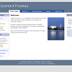
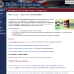
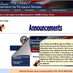
Because the majority of websites I created are behind a firewall, I have included images from the sites instead of direct links. I provided content support for one public VHA site, but the template and design were provided by their public affairs office. You can see some of my work at http://www.ehealth.va.gov/ The other Internet site I designed has since been changed, but I have included a screen shot of my original design in the gallery below.
This page contains sample images I created for use in .js based image galleries for various websites. I have also included some miscellaneous feature box images and home page previews where galleries and feature boxes were used.
Office of Informatics and Analytics (OIA) Features
The communications team used the rotating banner on their internal home page to feature information from Department of Veterans Affairs (VA) and Veterans Health Administration (VHA) news releases, public affairs features, various blog posts and staff news items. Images on the OIA site would often mirror larger images from VA/VHA communications campaigns but with text more specific to OIA needs. I would often have only a brief text description of a desired feature for the banner and would find, modify or create relevant images to pair with the text.
OIA Feature Boxes
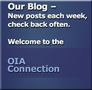 When we were designing the Intranet site for the newly created Office of Informatics and Analytics back in 2010, one of the main goals of the site was to make certain features highly visible to users. We decided to use bold color and large feature boxes to be both noticeable and allow room for descriptive text.
OIA was launching a new blog site and wanted to remind users of the site, as well as provide space for listing blog titles or subjects as needed.
OIA also launched a new communications resources page to provide the various programs within the office with helpful templates and other resources.
OIA Home Page Preview
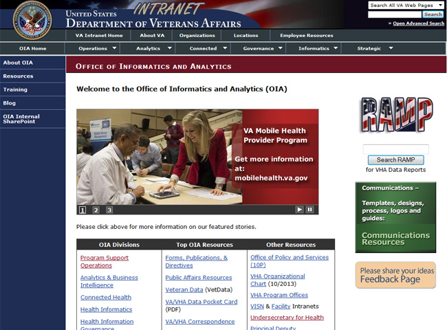
Below is a screen shot of the site with feature image gallery and feature box content. We didn’t want a lot of text on the home page, just plenty of links to resources.
VA websites use templates developed at the department level. The top graphics and blue navigation bar on VA Intranet sites are part of the mandated templates. I added extra drop down menus at the top to provide links to office sites and feature pages for the various OIA divisions. It is a large office with many divisions and sub-programs all connected together from the main home page.
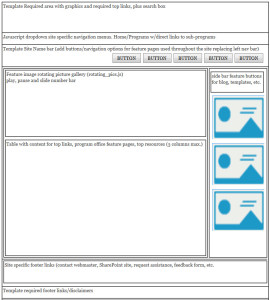
At one time the VA was going to implement a fully centered Intranet template, get rid of the left blue navigation bar, and put all navigation at the top. The early OIA site page layout was intended to make the transition to the new template easier. That template was never implemented. Original “no left nav” concept wireframe below:
Other sample site images: (see also Image Gallery)
- Another site I created and managed, a central clearing house for links to subprograms
- I added several expand/collapse sections to this page to cut back on the amount of scrolling that was required.
- VA has its own internally hosted version of WordPress. OIA was an early adopter of this blog technology and I helped launch and maintain their blog.
- When I first started with Cooper Thomas, they did not have a Web presence. I designed and launched their company website. This is the initial design, it has since been expanded and re-designed.
- One of 3 sub-sections of a larger site/office. Each had its own unique navigation and content.
- I managed the HIM site for many years. Their site was redesigned and migrated into Joomla PHP templates.
- This page represents a modification to the standard VA Intranet template, it has flyout navigation menus.


