Behind the Curtain: Why Responsive Design is Necessary
Why WordPress themes need to be fluid and adjust to a wide range of screen sizes.
Ready to get answers…
I’d love to chat about your website goals and why you should use best practices when designing a site to be responsive.
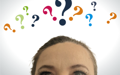
I recently had a client who was wondering why their website looked squished or stretched when they were messing around with their web browser size. Rather than bore them with REMs, EMs, pixels, and percentages, I decided to blog about it.
I am working with a theme that does responsive design pretty well. It isn’t perfect, Divi could do a lot more to cover a broader range of screen sizes, but overall it adjusts the look of websites to cover most options and lets me design for mobile and tablet much more easily than say… this one:


Chaos reigns in the mobile device world
Popular mobile devices come in a wide range of sizes. There is no set standard where iPhone, Android, Samsung and the like are concerned. Smartphones and tablets also adjust widths depending on the orientation of the device, from portrait to landscape. Of the popular mobile devices, there are over 30 iPhone phone sizes, over 18 Android/Google, 42 Samsung, 20 LG, etc. For popular tablets you have at least 17 Apple, 4 Samsung, and a wide variety of other brands. There is no standard screen experience and it will change with the next Pixel or iPhone release. The monitor industry is also extremely broad, especially with the advent of high definition 2k, 4k, 5k etc. You have a typical range of 19″ to over 34″ wide screens, 1080p to 5120p resolution (although 72 dots per inch is still the standard for image optimization), and it goes on and on. It is a pretty chaotic environment when it comes to viewing a website.
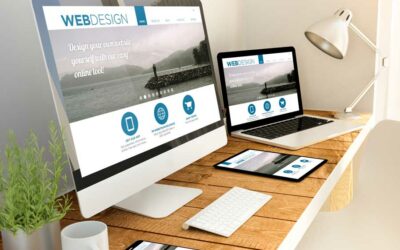
WordPress Themes and Responsive Design
The wide range of screen sizes means that all WordPress themes have to make best guesses when it comes to the user experience of viewing a website. The Divi theme is responsive and uses a combination of fluid grid layouts and media queries that work on all devices. Not all themes are created equally, but most modern themes like Divi do adapt page layouts to accomodate desktops, tablets and smartphones. When designed correctly, they adjust text sizes, image sizes, and how much empty/white space is used between sections. Responsive design means that columns need to go from being side by side to stacking on top of each other when the screen size reaches a certain width.
How the Divi Theme Handles Different Screen Sizes
Divi’s settings use a range of 3 sizes when allowing a designer to adjust things like heading and text sizes for different screens. For desktop settings 981 pixels and higher is used, for tablet settings it is 768 px to 980 px, anything lower than 768 px is for the mobile settings. Needless to say there is a pretty broad range of viewing options within those breakpoints. The optimal user viewing experience is between 1100 px and 1400 px. Anything within 981 pixels to 1079 pixels will be less than optimal and squished. Anything above 1400 px will be less than optimal and stretched. There is less variation at the tablet settings, but still a range of large tablet or normal tablet pixel widths. Then you end up with mobile phones where the page design needs to cover a range of over 400 pixels but not squish down too small, hence the need for mobile first thinking when it comes to number of columns allowed or image dimensions.
If you’ve ever heard the design term “media queries” this is the coding term that sets the stage for which pixel widths are allowed before a page layout adjusts. It is possible to create media queries that cover a wide range of screen sizes, but they vary enough that you can add a lot of chaos and custom coding if you use too many. This makes it harder for a client or another designer to change later. When you get into the realm of custom coding rather than use what is built in to a theme, the design becomes harder for a non-coder to maintain. You have to assign custom style sheet (CSS) IDs to individual page elements, then apply custom CSS to that ID which can be hard to find and change later on. It is one of the reasons why finding a good base theme is so important.
Divi’s built in media queries are set up to respond and adapt layouts within 6 typical device ranges.
Large Desktop: 1405px and above
Standard Desktop: between 1100px and 1405px
Laptops and Large Tablets: between 980px and 1100px
Tablets: between 768px and 980px
Smartphones and small Tablets: between 320px and 768px;
Smartphones: between 320px and 480px
Responsive Design Challenges
Responsive design comes with a few challenges. Some of the typical challenges you run across when trying to adapt the user experience for all of the various screen sizes out there include things like paragraph widow words (because you have to allow for text to flow at different screen sizes), long words where word wrap can be kind of broken on small screens, really long headings that have to wrap to multiple lines, trying to force image sizes to be a specific pixel amount rather than use a responsive value such as a percentage, trying to fit really big site logos into mobile menus, using negative top margins between sections to create overlap, background images that need to adjust to cover large rows, using too many columns, how column elements stack (for things like images beside text boxes), and a lot more. There are many finicky things you could adjust with custom media queries from typography sizes, to how the top menu behaves, how wide your columns can be, padding between columns, gutter widths, etc. This is why some of the best performing websites have a relatively simple page layout with fewer columns and plenty of white space.
The more you tweak the settings for an optimal viewing experience at desktop, the less optimal the experience is at tablet or mobile. The more you simplify for mobile or tablet, the less complex your desktop design will be. Sure, it is nifty to alternate text and images from left to right on stacked rows, but then at mobile the images will stack a bit oddly. Responsive design is a constant trade off of complexity and simplicity to allow a site to flow and shift while keeping text readable or images viewable. Every WordPress theme has to accommodate a lot of variations.
“I am the founder and primary designer of PCS Creative Services, LLC. With 25+ years of experience in small business operations and communications, and 13+ years of experience in web design, I’ve seen and solved many of the problems faced by business owners. My passion is helping small business owners in Utah build effective, purpose-driven online content. Contact me today.”
Latest from the Blog:
Behind the Curtain of Pricing a Website Project
Why pricing a website SHOULD include answering 40 questions (or more!).Ready to get answers...I'd love to chat about your website goals, marketing goals, and why you should take my 40 questions challenge.Another day, another "how much do you charge for a website?"...
Why Do Small Businesses Use WordPress for Their Websites?
You read it right, 455 Million! That's the number of websites that used WordPress globally in 2021, and that number is on the rise. This isn't a coincidence, either.You don't know what you don't know...I'd love to chat about your website goals, marketing goals, and...
Three Website Design Tips in 2022
It's a new year, and with the web industry continually changing, you need your website design to stand out in 2022. Get ahead of your competition by giving your website visitors exactly what they are looking for when they land on your website. Read on for three basic...
I promise, I don’t send spam